UNT DIGITAL LIBRARIES
UX Research | Interface Design | Prototyping
The current UNT Libraries Advanced Search page is intended to support precise, targeted research. However, its purpose and interface are not clear, leaving many users confused about when or why to use it.
The interface itself is overwhelming, presenting a dense set of filters and options without clear hierarchy or guidance. Many users skip important tips buried at the bottom, and duplicated or unclear options create friction. The boolean logic elements could be simplified or replaced with more intuitive controls: around half of the intended target may fully understand Boolean logic.
As the UX/UI Student assistant for the UNT Digital Libraries, I was tasked with redesigning the "Advanced Search" page of the university library website.
Key Deliverables
Click on each image to learn more
Research revealed that Advanced Search serves a wide range of users, from graduate researchers and faculty to undergraduates and the general public. While experienced users rely on precision filtering, many less frequent users feel overwhelmed by dense filters, unclear terminology, and Boolean logic they don’t fully understand.
Search analytics showed high demand for textbooks, music archives, and games, yet many users don’t realize the catalog can help locate textbooks. Several filters were rarely used, suggesting unnecessary complexity. Competitor analysis, particularly NYU Libraries, demonstrated that advanced search works best when embedded naturally into the core search experience rather than presented as a separate, intimidating tool.

Research/Problem
I began by creating an initial Figma draft inspired by competitor patterns and shared it on GitLab for team feedback. Early discussions highlighted the value of unifying basic and advanced search, but also raised concerns about visual consistency, outdated design patterns, and backend feasibility.
Feedback from the UX developer and team lead led to a pivotal insight: instead of committing to one solution, I should explore two design directions, one that prioritizes functional consolidation and another that emphasizes UNT Libraries’ broader branding, then validate both through user testing.

Ideation and Collaboration
Design 1 stays closely aligned with the existing catalog experience. Advanced Search is integrated as a dropdown extension of basic search, reducing page navigation and keeping the interface familiar for returning users.
This approach focuses on simplicity, minimal visual changes, and feasibility. It reduces cognitive load by surfacing advanced options only when needed, making it a strong candidate for incremental improvement without heavy backend changes.

Design 1
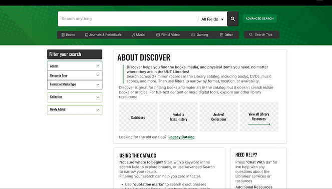
Design 2 reimagines the Discover page as a secondary library homepage, visually aligned with UNT Libraries’ main site. It uses clearer hierarchy and branding to help users understand the catalog’s purpose before engaging with search tools.
In this version, Advanced Search remains a separate but simplified page. While less consolidated, it provides a cleaner learning curve for newer users and works within current technical limitations. Ideally, this design could later be paired with the unified functionality explored in Design 1.

Design 2
This project taught me the process of collaborating with developers, as well as breaking down one large project (the whole website) into pieces (just the advanced search), to ensure that each piece is well thought out.
It also helped me understand the importance of details and how much work goes into just one function!