SYFT PRODUCT CARD
2026
DESIGN SYSTEMS & COMPONENT CREATION

PROJECT OVERVIEW
When creating a product, the systems and rules behind it are what make or break it. As a UX/UI intern at SYFT, I focused on design systems and component work, along with creating a cohesive presence through visual branding and design.
In this role, I got to experience firsthand what it’s like working as a design systems associate under a design systems lead at JP Morgan. I learned so much about Figma, really understanding auto layout and libraries, as well as methodologies like atomic design, and how systems create consistency, scalability, and better collaboration across teams.
PROBLEM
SYFT must deliver high-value information without disrupting the browsing experience, and overwhelming users by packing limited space with non-essential details. Because users turn to SYFT for fast, actionable insight, there is a clear need for a UI that balances transparency with visual clarity.
How might we design a product card component that makes users feel like their needs are seen, performs within narrow spatial constraints, and enables confident, at-a-glance decisions?
Role
UX/UI Intern
Company
SYFT Fashion
Team
Nathan Proffitt - Design Lead
Arianne Poblete - UX/UI Intern
Timeline
1 month
Explore the problem space and what the component is solving for
Begin to identify user context/needs/pain points
Start conceptualizing solution directions
OBJECTIVES
RESEARCH INSIGHTS
I started by researching the expectations of a product card. What do people expect from, and how do they interact with this component? For this project we strictly followed the Double Diamond method: this was the discover phase.
Users scan product cards rather than read them, preferring cards with 3–5 pieces of information
01
Cards with strong visual hierarchy perform better, &
whitespace improves perceived quality
02
Poor quality or inconsistent sizing for images causes users to skip cards entirely, even for products they'd want.
03
Image and price are processed before description
Users hover over cards to preview
04
USER CONTEXT
Gen-Z women who are trend-driven and social media savvy.
Naomi

21 year old college student and young professional, looking for fashion product that are her style, and match the trends that she follows.
Needs
-
Relevant information quickly
-
To find a product that fits her context
-
Less frustrations in her shopping experiences
-
A seamless experience
Wants
-
To see why a product is relevant to her needs
-
To know that she can trust the engine
-
To dress relevant and trend-driven

We are now soundly in the define phase!
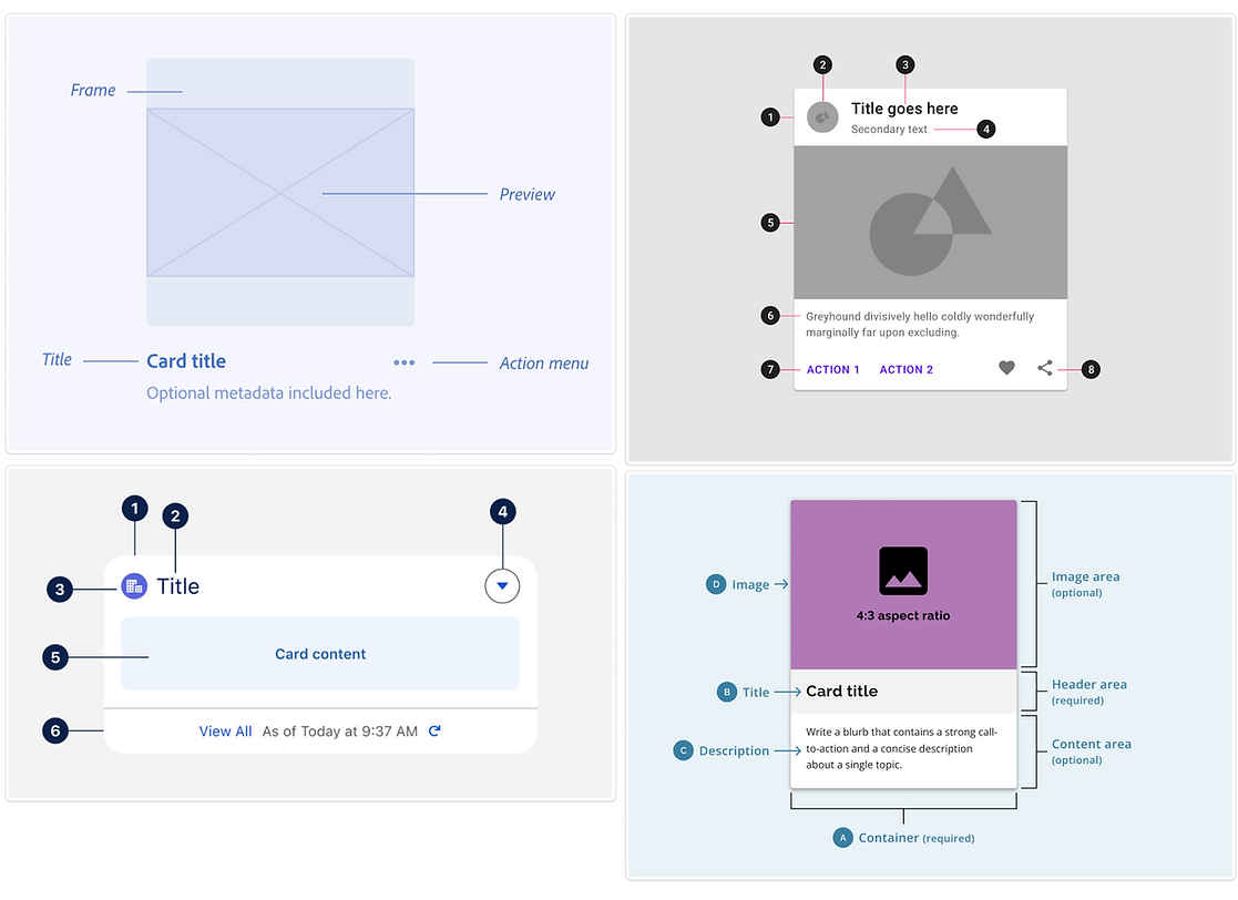
ANALYZING EFFECTIVE PRODUCT CARDS


PRIORITIZATIONS AND TRADEOFFS

INTERACTION CONTEXT
This context map aligned all of my research including user needs, existing context, and interaction flow, directly informing layout, content hierarchy, and card behavior. It also opened a question of how will the product page open after clicking on the card?
So much thinking goes into the small details! After working on this I truly understood and respected the work of Design Systems professionals.

LOW-FIDELITY WIREFRAMES
I began with ideating three different possible styles, displaying modular heights for each. This helped with hierarchy decisions, and picking out the "atoms" within the "molecule."


IDENTIFYING FOUNDATIONAL ELEMENTS
Using established design systems library, I gathered existing elements (colors, spacing/padding & corner rules, etc.)
HOVER STATES TEST
I made a few variants and tested a hover state with each. This was the beginning of the develop phase.
Hover over each card to see the hover state for each!
CHOOSING THE RIGHT DESIGN
In a group, we identified areas of the mid-fidelity prototypes that aligned best with SYFT and the interaction context.


FINAL DESIGN
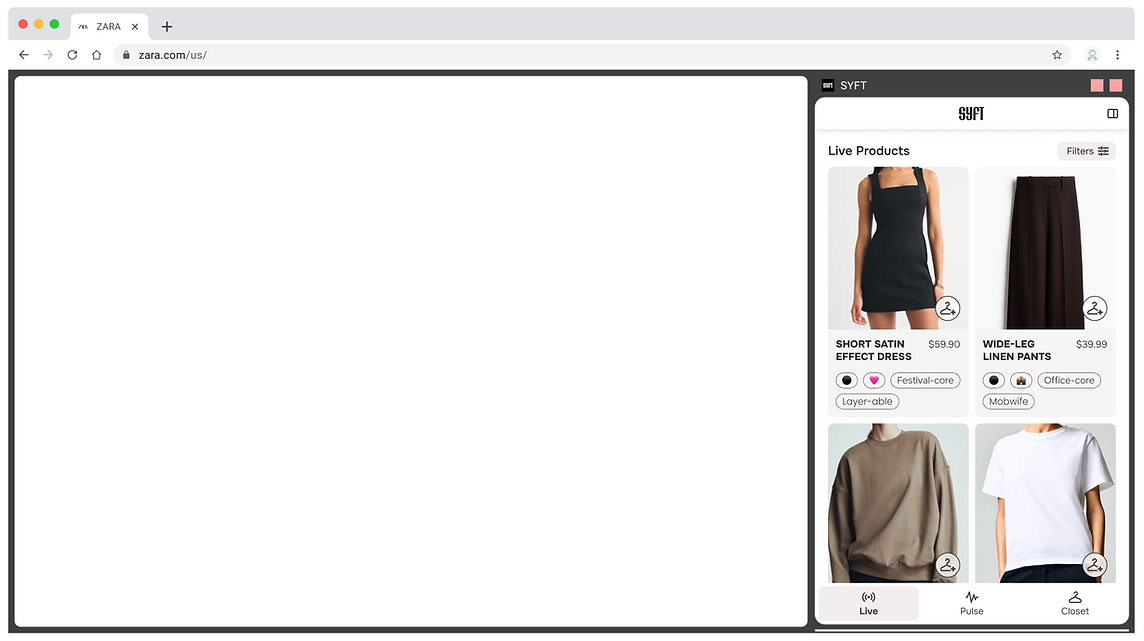
IN CONTEXT
GALLERY
A showcase of other projects I did for SYFT, including brand systems and logo ideating:


