UNT REC SPORTS
2025
MOBILE APP UX/UI OVERHAUL

PROJECT OVERVIEW
This project is an entire UI and UX overhaul for the UNT Rec Sports app. To truly deliver a "modern workout experience," the digital experience needed a refresh. Now is the time to bridge that gap, ensuring the app is as streamlined and high-performing as the newly renovated facilities it supports.
Simplifying the interface and prioritizing core actions can transform the app from a barrier into a seamless part of the Rec Center experience.
PROBLEM
Students at UNT struggle to efficiently navigate the Rec Center app, with 79% taking over 4 seconds to find its primary function. While the university continues to modernize the Rec Center’s physical space, the digital experience remains unintuitive.
As a result, there is a clear need to simplify the app’s interface, reduce cognitive strain, and create a faster, more seamless entry experience.
Role
UX/UI Designer (Passion Project)
Company
University of North Texas - Recreational Sports
Timeline
2 weeks
SURVEYS AND INTERVIEWS!
Through digital and physical flyers, I gathered 60 UNT Students and Staff who have used the Recreation Center at least once.
61%
of users visit the rec center at least once a week have never heard of the app.
The app is unused and unknown, even by heavy Rec Center users:
57%
of users go to the rec center solely for personal workouts
This means that these users only have one mobile touchpoint: checking in
76%
of the current app users use it only for the digital ID feature - making it the main user function.
I asked users to navigate to the main function of the app - the digital ID.
CURRENT USABILITY AUDIT
36%
took 8 seconds or longer.
43%
took 4-7 seconds, which is acceptable, but displays some difficulty.
21%
of users found it immediately (1-3 seconds).
I also asked users to identify three functions that would make them want to use the app. I would use this to prioritize functions when redesigning!

Apple wallet digital ID
Digital ID (90)

Apple Fitness
Fitness/Check in tracking (55)

GroupMe
Finding groups, establishing niche communities (33)
These insights helped guide a visual audit of the original app, as well as brainstorm what could be added to make the app even more appealing to users.

SORTING AND PRIORITIZING APP FUNCTIONS

LOW FIDELITY PROTOTYPING
Sketching low-fidelity wirefames is one of my favorite ways to ensure a smooth user flow. It helps me remain conscious of how to keep the design simple and intuitive.

DECISIONS MADE
-
The addition of a bottom navigation bar in order to separate main pages: Home, Explore, Saved/Calendar, and Groups.
-
These pages cover all of the categories that the users find to be most important, and preserving and reorganizing vital information that the original app had.
-
-
Interactive elements to feel intuitive, and to delight users:
-
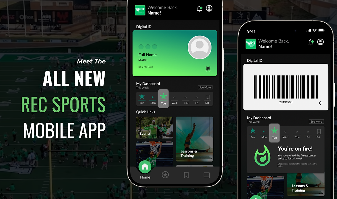
A digital ID that resembles an actual student ID. The component has the ability to flip and reveal the scannable barcode in order to enter the recreation center.
-
Weekly calendar that logs your saves, check-ins, and personal fitness progress
-
-
Building some resources into the site
-
Information such as the gym's address, phone number, and email do not need to be linked to the UNT website, they can be built directly into the app for simple experiences with as little backtracking as possible.
-
(current flow is [Rec Center Hours] > External Link > [Rec Center Hours PDF])


FINAL PROTOTYPE
HOME SCREEN
Built with user needs in mind.
EXPLORE
To highlight and educate about the community-building offerings of the Rec Center.
SAVED + CALENDAR
To empower users, transforming the app into a personal health assistant.

GROUPS
To add a community-building element that users have been asking for.
KEY COMPONENTS


SANITY CHECK - USABILITY AUDIT
Again, I asked users to navigate to the main function of the app - the digital ID.
100%
found it immediately.
🎉
🥳
I created a pitch deck and presented the redesign to the Assistant Dean, formerly the Senior IT Support Manager at UNT.
He connected me with the app's development team, which happened to be an external vendor, and I delivered the prototype for technical evaluation and potential implementation.
VALIDATE
.png)